After 20 years of teaching at Brookfield Central, I am saying goodbye. Although I spent the majority of that time in the physics classroom alongside my learners. That changed for my last 18 weeks. I ended up in a place similar to where I started, teaching chemistry and biology. So, rather than dealing with juniors and seniors at the end of their high school careers, I was in classrooms with freshmen and sophomores still trying to find their place. At the same time, I was learning and teaching a set curriculum I hadn't taught in over a decade. So, we were learning. But, of course, I already knew the content. The point of this post is to take a step back, reflect, and share the gratitude from the last students I had in my 20 years at Brookfield Central High School, as expressed through the cards and notes they made for me on my last day with them. I don't take many "yay me" moments. But after 20 years, I'll soak this one in.
As I enter my 5th year of using Canvas as an LMS, I’ve come a long way in terms of how I design the look of my course to facilitate simpler and more transparent workflows for my learners.
So, I just wanted to give you a quick tour because a lot of what I have learned has come from others sharing out to the greater EdTech community. So, I just want to keep paying it forward. The biggest breakthrough for me is embedding Google Slides into my site pages. It is really a game changer
Dashboard
First things first. If you haven’t added an image to your course to appear in the dashboard, get on it. It’ll make your course easier to identify and stand out.
This can all be done in the SETTINGS section.
If you’re interested in creating GIFs instead of just static images, check out this post.
- In FEATURE OPTIONS, turn on ENABLE DASHBOARD IMAGES FOR CANVAS.
- In COURSE DETAILS, click on IMAGE to upload or change your current image. You can upload a jpeg.
Home Page
My home page is a page that I created in canvas and set as the home page. The home page is divided into 2 distinct areas: Weekly Schedule and Unit Pages Buttons.
Weekly Schedule
This is the first thing students will see when they enter the course, so I wanted this space to be meaningful. It is prime real estate! So I embedded a Google Slide presentation which shows what is being done in class that day and what is being done that week. I update the daily list each morning and start a new slide for each week. That way students can go back to see what was done previous weeks. In addition, where appropriate, direct links will take students to locations within Canvas such as Assignment Pages.Using the Embed code from Google Slides and pasting it into the HTML editor makes it easy to publish a slide presentation right into Canvas. Get the Embed code by publishing to the web from Google Slides.
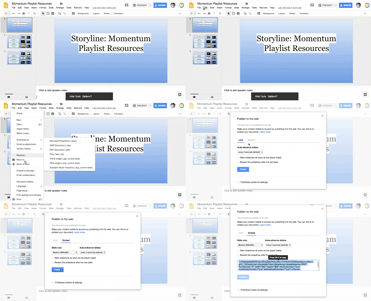
Then paste the code into the HTML editor
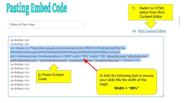
If the slide window is not as wide as you would like, a little trick that I do is putting the following text into the embed code: width = “99%”. That just ensures that the slides take up 99% of the available width.
Unit Pages Menu
For each unit, I create a different page in Canvas. Each page is then linked directly from the home page with an image that serves as a button. Of course I use GIFs, but any image will do. But make sure it has some text to indicate where it will take students. Another way to use Google Slides is to make your a slide for each button and then download them as jpegs from the FILE menu in Google Slides (File -> Download as -> JPEG image). To make the most of your space, using a table to arrange the images is helpful.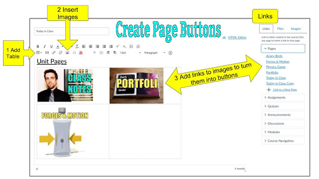
Individual Unit Page
Each unit page created has a list of the assignments that will be digitally submitted. This will be around 5 - 6 per unit. Then there is a slide show containing practice resources for the unit.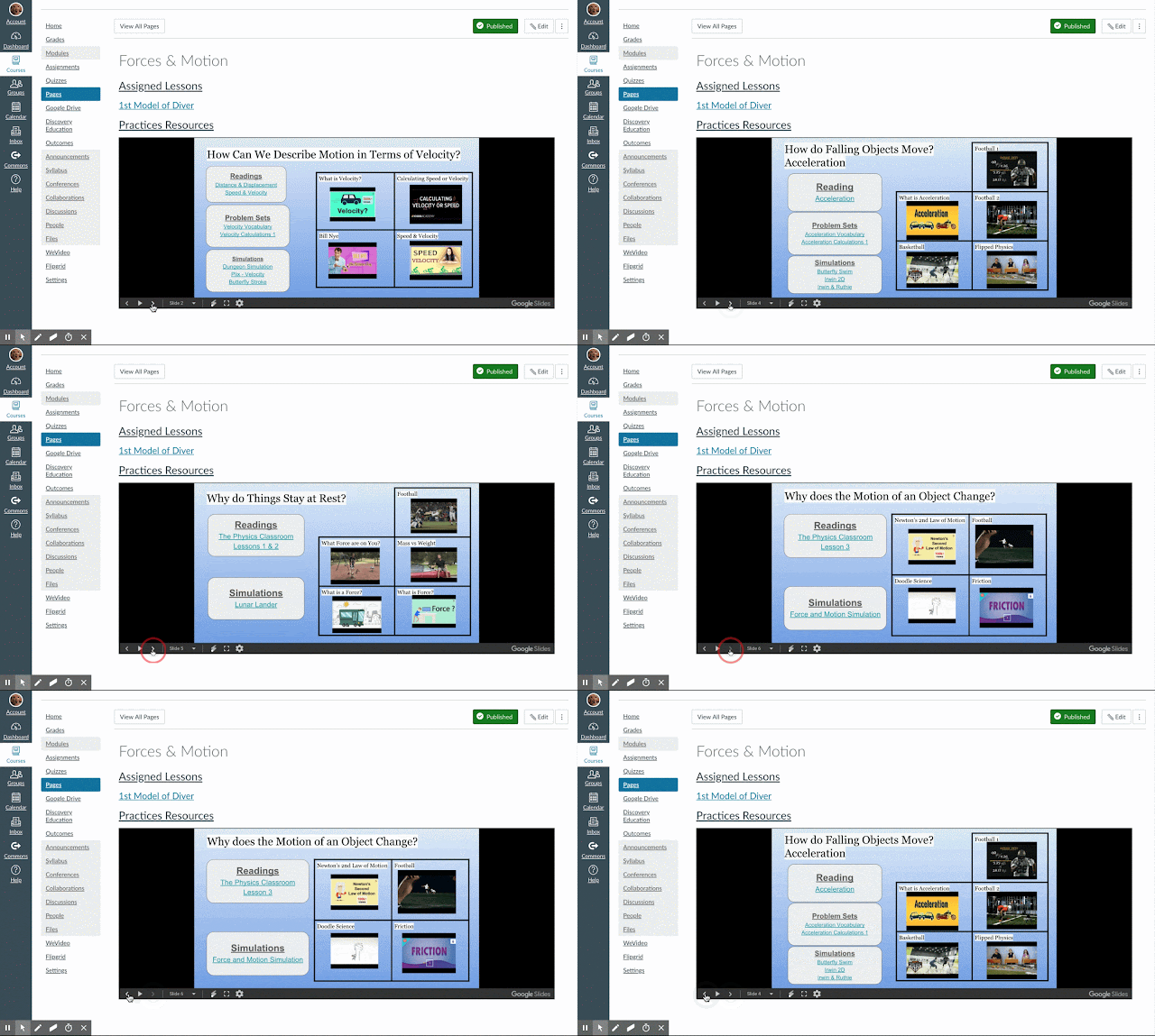
Assigned Lessons
Rather than going with the module view, I try to make the page as clean as possible. I start with the list of digital submissions to make it clear what EVERYONE needs to be sure and submit. I add them as they are introduced. So there is only one right now. But using the sidebar makes adding the assignment a one click process.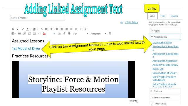
I usually play around with font sizes to make sure that students can easily read the lettering.
Practice Resources
I used to use modules or tables to organize my practice resources, but it became a the “Scroll of Death”. Organizing my practice resources into slides has made it much more manageable. On each page there is a variety of practice modes including links to readings, simulations, practice quizzes on Canvas, and YouTube Videos.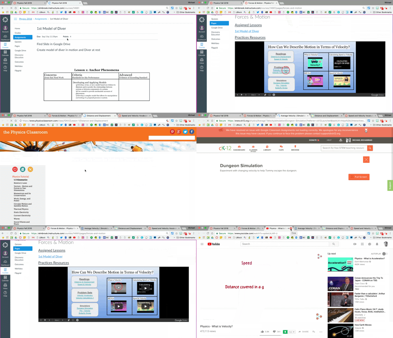
Because it is an embedded slide deck, students just click to go through different topics. As a teacher, I can go into the Slide Deck and control which slide is seen first and hide slides I don’t want to appear yet.
Assignment Pages
I love using SpeedGrader as a feedback tool for learners. This year I am moving away from 4 point rubrics to single point rubrics. In the assignment detail, I embed the Google Doc of the rubric just like I would for a Google Slideshow. This allows for a very clean look, but also allows me to make edits in the doc and have them reflected in the version seen on Canvas. Edits in the doc are reflected in the published version embedded on the assignment page.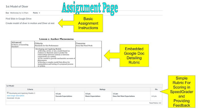
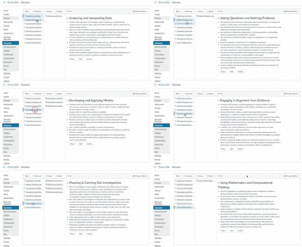
Then, I build the rubric for SpeedGrader. Because the rubrics are built around the same science practices, I create the criteria for the overarching outcomes in the OUTCOME section of Canvas. This allows me to easily import them into any assignment rubric I want to create.
One of my main goals in using Canvas is to make workflows manageable from the STUDENT perspective. That means reducing the number of student clicks and scrolling to get where they need to go. I look forward to getting feedback from my learners about the new course design and what would make it easier to work with.
I would love to see how you are organizing your Canvas course this year. I am always looking to learn how others are innovating in Canvas!


Comments
Post a Comment